One of the most important pages on any small business website is the contact page. For a lot of companies, it may be the main reason they have a website to begin with. Having a great contact page on your website can really improve user experience, which (in the long run) will improve your website’s SEO. In this post, we’ll walk through what you should put on this important page, and we’ll give you some helpful examples.
When thinking about what to put on your contact page, think about what you expect to find when you get there. Put yourself in your customers’ shoes and ask yourself what things you would hope to see on this page. Use those answers to help inform your design decisions. Regardless of which industry you are in, here are a few things every contact page should have.
Estimated reading time: 5 minutes
1. Your NAP
NAP stands for Name, Address, Phone Number. You can (and should) also include a company email address here, too. If you have multiple locations, consider making separate landing pages for these to better organize the information.
Your NAP are some of the most important details you will list on your site, as they tell customers who you are, where they can find you, and how they can get in touch. Place these in a prominent spot on your contact page to make it easy for customers to get that information.
Read More: What Is NAP Information And Why Is It Important For SEO?
2. Contact form
Another essential feature every contact page should have is some sort of contact form. Not all visitors will want to call you or write you an email. So, make sure the option is available for them to fill out a few fields and shoot a quick message. Moreover, when using contact forms, try to keep it simple! Only ask for the bare minimum amount of information you need. Don’t request too much, or you’ll intimidate your visitors. No one will want to fill out the form!
We really like Kinsta’s contact form design. They keep everything sleek and organized, while at the same time providing a great user experience and streamlining their workflow for responding to messages.
3. Map with directions
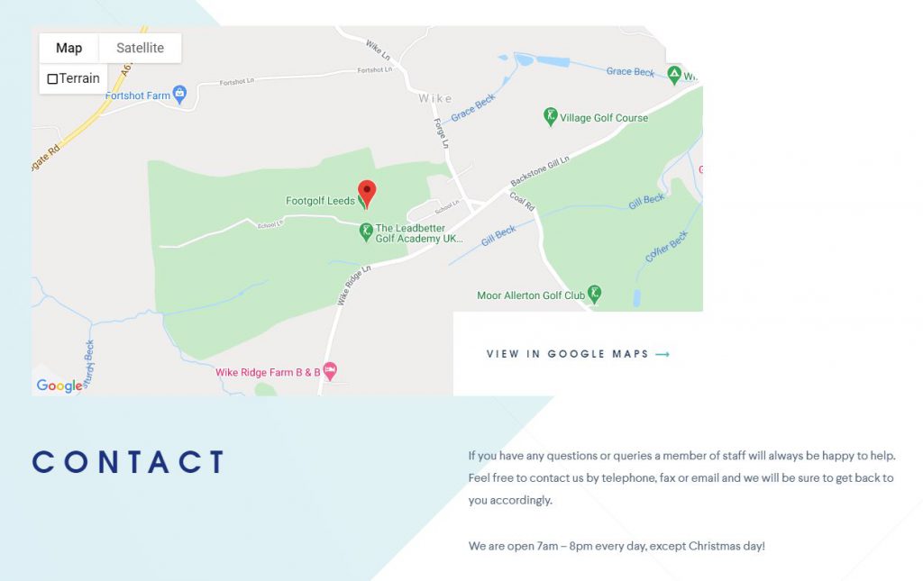
The next feature you should consider for your contact page is a Google map with direction functionality. While it’s not required per se, having a map helps visitors who might want to get directions to your store or know in what general area your business is located.

This contact page from Leeds Golf Course features a decent-sized Google map, with several display options. They even have a link to open the map in Google Maps, so the visitor can get directions to their main lodge.
4. Great call to action
Make sure you design a great call to action (CTA) for your contact page. We recommend choosing your preferred contact method (e.g. form emails) and making that the prominent CTA for this page. A great CTA could be as simple as the Send button on your contact form or a phone number displayed in a prominent place. Regardless of what you decide, let your visitors know what you want them to do on that page: contact you!
5. Key staff members
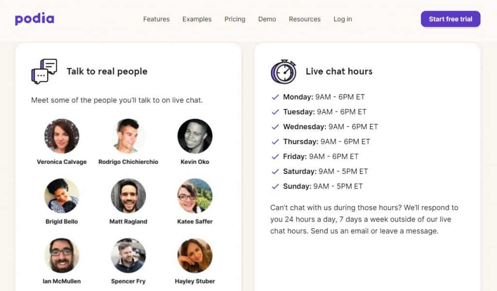
By displaying key members of your team, you let visitors know who they’ll be talking to when they call or email. This makes your business much more personable and friendly. Add some nice headshots, along with the appropriate contact info for each staff member.

If you have multiple departments at your company, add clear headings and list the appropriate contact person and details for each one. This helps avoid confusion and wasted time contacting the wrong person!
6. An image of your building
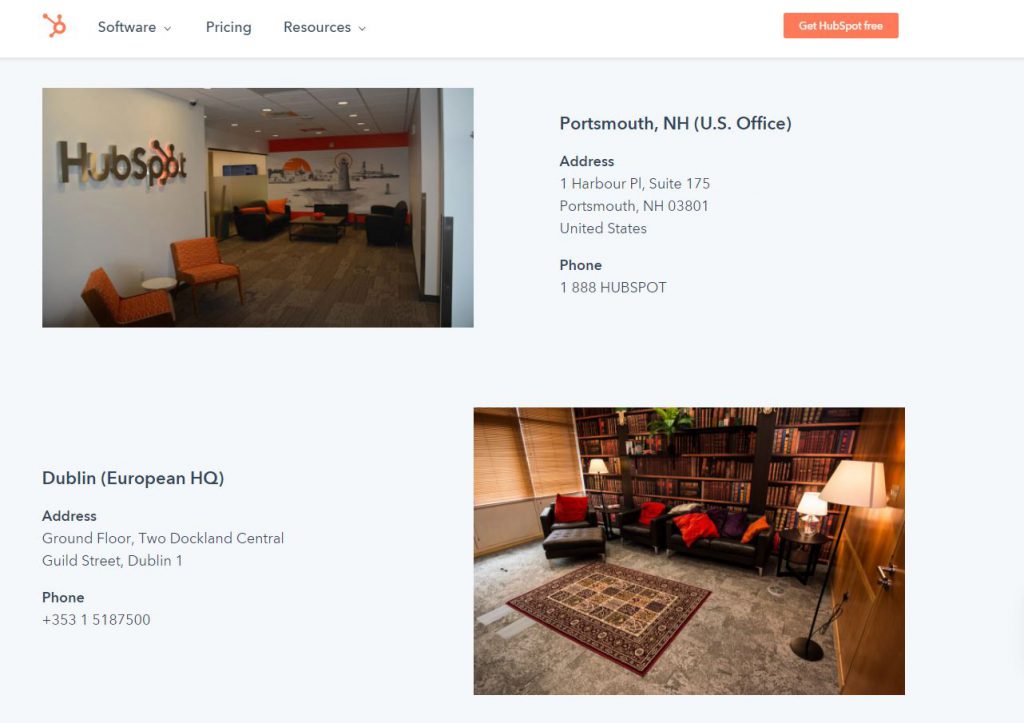
If you have a brick and mortar location that customers visit, you should also add an image of your building to your contact page. This helps people instantly recognize your business when they drive up or walk into it. It can also help you with your SEO, since you can optimize the image for your brand name.

Hubspot’s contact page does a great job with this. They show images for each of their offices, along with the address and phone number.
7. Active social profiles
One last thing you want to put on your contact page are your active social profiles. Social media is increasingly becoming more useful for certain small businesses to stay in touch with customers, engage in relevant conversations, and remediate negative experiences with their brand.
Notice we said only list your active profiles. If you have a Twitter account you never check, there’s no sense in sending people there to contact you. Decide which social platforms work best for your business, and list those on your contact page!
Spice up that contact page!
Adding things like maps, images, social buttons, and a great call to action can really make your contact page stand out. Not only that, but they can improve the user experience of your page, which helps your SEO in the long run. What other things do you think you could include to make an awesome contact page? Let us know in the comments!
Read More: Which Is Better: A Website Or Facebook Business Page?

